Modularized Mint
Responsibilities: Product & Design Strategy
Team: Product Designer (me), Product Manager, Content Writer
Background
As Mint started to define our new customer segment - the financial beginner, often falls under the millennial demographic, the fundamental user journey changed. Taking a look at Mint through a millennia's eyes, it's all too overwhelming. We saw declining retention amongst millennials, specifically those who did not identify as trackers. Mint was originally built for the "tracker" personality, but we soon saturated that market, and realized that trackers are a very small group, and we were isolating the larger group that needed help.
Mint's current experience is very straightforward, almost too straightforward. Here are the key steps:
The user signs up for Mint
User is prompted to add their Financial Account - this means giving Mint your bank login and password, rather sensitive information without much value upfront
Once the user adds their account, all of Mint's features are activated:
Accounts
Advice
Credit Score (unregistered)
Budgets (automatically set up)
Investments (empty no investment account added)
Trends
Bills (with credit card bills from financial account)
Offers
Goals
Modular approach
There are several issues with this flow, but the primary one is that the user is often left without no clear next steps. Most of the features are irrelevant at the start. Our research revealed that users often have one or two primary tasks in mind when they sign up - budgeting, seeing all accounts in one place, or financial goals (debt/loan payoff). The current experience does not ask, or acknowledge where the users are coming from, and what they want right now. The "Mint for Me" acknowledges that you can come in with a clear intention, and evolve to more complex financial tasks like tracking investments, applying for credit cards, etc.
From overwhelming
Starting in the deep end, asking all users to add an account without a clear benefit up front
No clear milestones, Mint isn’t looking forward
No clear next steps, Mint doesn’t know me (why I’m here, what I need)
To Confidence Instilling
Start with a quick win, let me finish something immediately
I have a direction forward, I feel supported
Give me clear next steps, success is defined up front. Mint is personalized for my financial goals
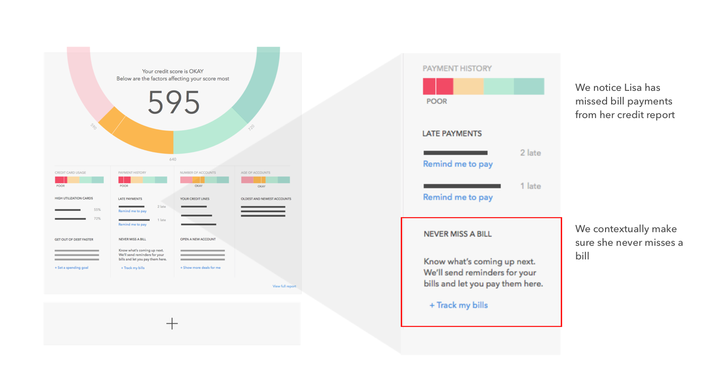
On the left is one such journey that I used as an example to illustrate how a Modular Mint would work. Since I was in the Credit Score team at the time, I went with a Credit Score First experience, and how we can graduate users to do more with Mint.
It starts with Lisa seeing an ad to get her Free Credit Score in Mint through the regular sign up process.
Lisa's Mint account
3 months after sign up
The account looks a lot different from when she started, but features are only added as she chooses to, so everything on the screen is familiar. Mint identified next steps, and Lisa chose her desired path to financial freedom.


