Boost
Responsibilities: Product & Design Strategy, UX Research, End-to-End Design
Team: Product Designer (me), Product Manager, Business Analyst, 3 Engineers
Background
Boost is an a la carte offering that gets members more attention and likes by putting them at the top of the DoubleTake stack. Sold as tokens, members can activate their Boost whenever they wish to, and expect to get a burst of attention in the form of Likes during this period. If a Boost session is successful, members get more likes than they normally would. OkC first conceived the idea of Boosts that eventually became common in every popular dating app, however OkC did not iterate on it much since it was first built which led to a fragmented experience for merchandising, and a lack of attribution that led to members not seeing the value of their Boost session.
The Goal
Increase Monthly Active Users who purchase Boost from 0.6% to 1%
Increase repurchase rates by 1%
Known issues
Resubscribe rates were lower than 5%
No merchandising in the product for during or after a Boost session
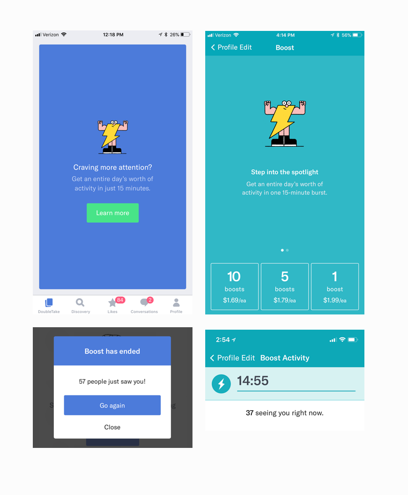
The color system and attribution for attention received was inconsistent which made Boost seem less effective than it was
Members could once see a list of who was seeing their profiles, however this was removed a long time ago without a replacement to provide members an insight into what their Boost session was doing for them
Pictured on the left is the inconsistent visual system applied to Boost across the product.
Research
Emailed 1000 Boost purchasers evenly split between repurchased and one time purchasers to —
Find ways to improve the Boost experience
Understand what returning users purchase Boost
Understand what causes users to never repurchase Boost
Find out what users are expecting from Boost
“Online dating is one of the most demoralizing things I’ve ever done. I loathe it and it often leaves me depressed, because it seems so hopeless. I’m trying to pay so I can more quickly reach the point where I don’t have to experience this soul crushing machine. I despise the idea of being strung along in this torturous system. So I’m not at all eager to use Boost in the future.”
Merchandising
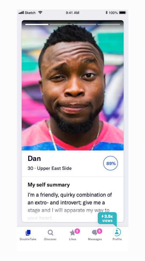
The first step in revamping Boost was to add attribution across the product to reinforce the value of a Boost session long after the session was completed
New ad units and placements at relevant points throughout the experience
Cleaning up the color palette to brand Boost with the teal everywhere to increase recognition when it was seen elsewhere in the product
Photo upload
Going through the user journey, we realized members are not prompted to get Boosts, or even use their existing Boosts nearly enough. Our data analytics team noticed that members who purchased a 5, or 10 pack token often only use their tokens within the first day of purchasing it, and a large portion of tokens expire without use.
We found several points where prompting members to Boost would feel relevant - when they upload new photos, update their profile, un-match with someone they were talking to, or looking through their matches
Uploading new photos was the easiest one to test with our internal CRM tool
Used wins to justify building out contextual entry points natively
▲ 10%
Increase in revenue
Boosts used by 12%
Deletes reduced by 3%
Attribution
The research also revealed that members did not really know how valuable their Boost session was. The first step to increasing repurchase rates was to create a halo effect by attributing every like, message, and conversation that was a result of a Boost session far beyond the session itself. Using the Bolt across several parts of the product would also reinforce the value and awareness, reminding members about this “fast-track” way to get attention when they needed it.
Boost 2.0
After seeing some promising results from merchandising and attribution, we took a closer look at how Boost actually works
We wanted to give members an insight into how their Boost was working during the session itself
Upon doing some analysis, we found that over 60% of Boosts resulted in one or fewer likes, and over 85% of Boosts resulted in just one like — we weren’t providing the attention we promised. This meant that there was only so much UX could do when the system itself was not working
We rebuilt the backend for Boost to ensure members were getting the attention they were promised
The rebuilt Boost was rolled out with a new Active Boosting experience, of which some elements are shown below
Internal Tracking
Designed a tool for CX to monitor how Boost 2.0 was performing in order to respond to requests
Ability to see the member’s gender/orientation to determine what baseline attention rate for their liquidity
Wanted to provide CX a way to differentiate regular Boosts from Auto-Boost — a premium feature had diminishing returns over time which made restoring tokens easier
Additionally, we internally had determined if a Boost session resulted in a lower attention rate than the member would normally get, their token would be restored
Results
Raised Boost revenue by 55% YoY, resubscribe rates increased by 4% YoY
Increased boost usage by 46%
First Time Purchases increased by 74%
Increased penetration of MAU purchasing Boost tokens from 0.6% to 5.5% (~450%)
Contextual entry point modals have increased Boost revenue by 21% and Boost tokens used by 24%


