Merchandising Events
Responsibilities: Product & Design Strategy, Pilot Planning, End-to-end design
Team: Sr. Product Designer (IC/me), Product Manager, 6 engineers
Background
Based on significant user research over the years, Meetup’s Design & Strategy team identified an opportunity to help members better evaluate an event by providing a clear understanding of what to expect at the event and whether it would be a good fit for them.
This coupled with an internal initiative following a formal debate that resulted in building a brand new stack for Meetup and re-platforming gave the team a unique opportunity to rethink our events from the ground up.
The Event Home’s primary purpose is to help users evaluate the event
i.e. after a member has discovered an event, but before they commit or express interest in the event.
The first phase of rethinking events was focused on merchandising because it can:
Increase the quality of events across the platform
Decrease the cognitive load for organizers when creating events
Eventually feed more accurate data into our recommendation models to support our matching for events < > members < > organizers
How members evaluate events
Logistics
Date, time, location. Does this work for my schedule?
Preparation
Do I need to bring anything? What is provided?
Event format
What will happen at the event? Speaking event, networking?
Reputation
What the past events have been like, who went?
People
Who will be there? Who is hosting, attending, leading?
Sharing
I don’t want to go alone, will a friend go with me? Can I sign up for them?
Vibe
What will the event be like? Lively, young, energetic?
Classic Event Home
Organizers who want to, can create high quality events but have not been incentivized or coached to do so. Expectation setting is not clear and consistent across events, and largely driven by the organizers. Here are two different events on Meetup that show the wide spectrum of information members can expect. The videos on the right is what Meetup events used to look like before the addition of new structured fields and the designs below.
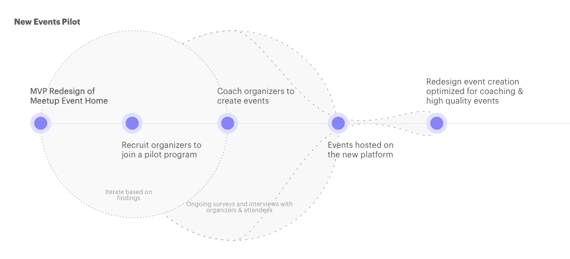
A pilot approach was chosen to be able to iterate quickly and collaboratively with a group of organizers. While we had high confidence in some structured and unstructured fields we wanted to add, we understood that the Event Home can be merchandised differently based on the type of event. For Meetup to be a successful platform, we need organizers to host high-quality events frequently. Since organizers would ultimately have to create these events we wanted to partner with them to find a balance in the information and work we would be asking them to put in. This would ultimately drive how we think about and create tools for organizers to create and manage their events.
Meetup has been around for over 18 years, which means we have every shape, size, and form of group hosting a variety of events. However, for us to create a simpler event experience, we narrowed our scope by determining a target audience that we would build for. This gave us a solid starting point and we recruited organizers across the United States who met these criteria.
We spoke to over 50 organizers to learn more about their events and share information about the pilot so they could opt into this experience.
Balancing presentation
Structured & unstructured data
One of the biggest challenges of the redesigned events page was the balance of structured and unstructured data. Every organizer on Meetup has a unique personality and their own community-building tactics, the people and their unique identities is what makes Meetup a community platform. Our job is to build a platform enables organizers to build these rich communities — so finding ways to retain that personality while still collecting structured information presents its own challenges.
We enhanced and introduced several new fields such as the Host Bio to let organizers tell their story and let their potential attendees get to know the host before attending. Adding rich text formatting to the description, and the ability to add several feature photos to an event were other unstructured fields that would help organizers merchandise their events through personalization.
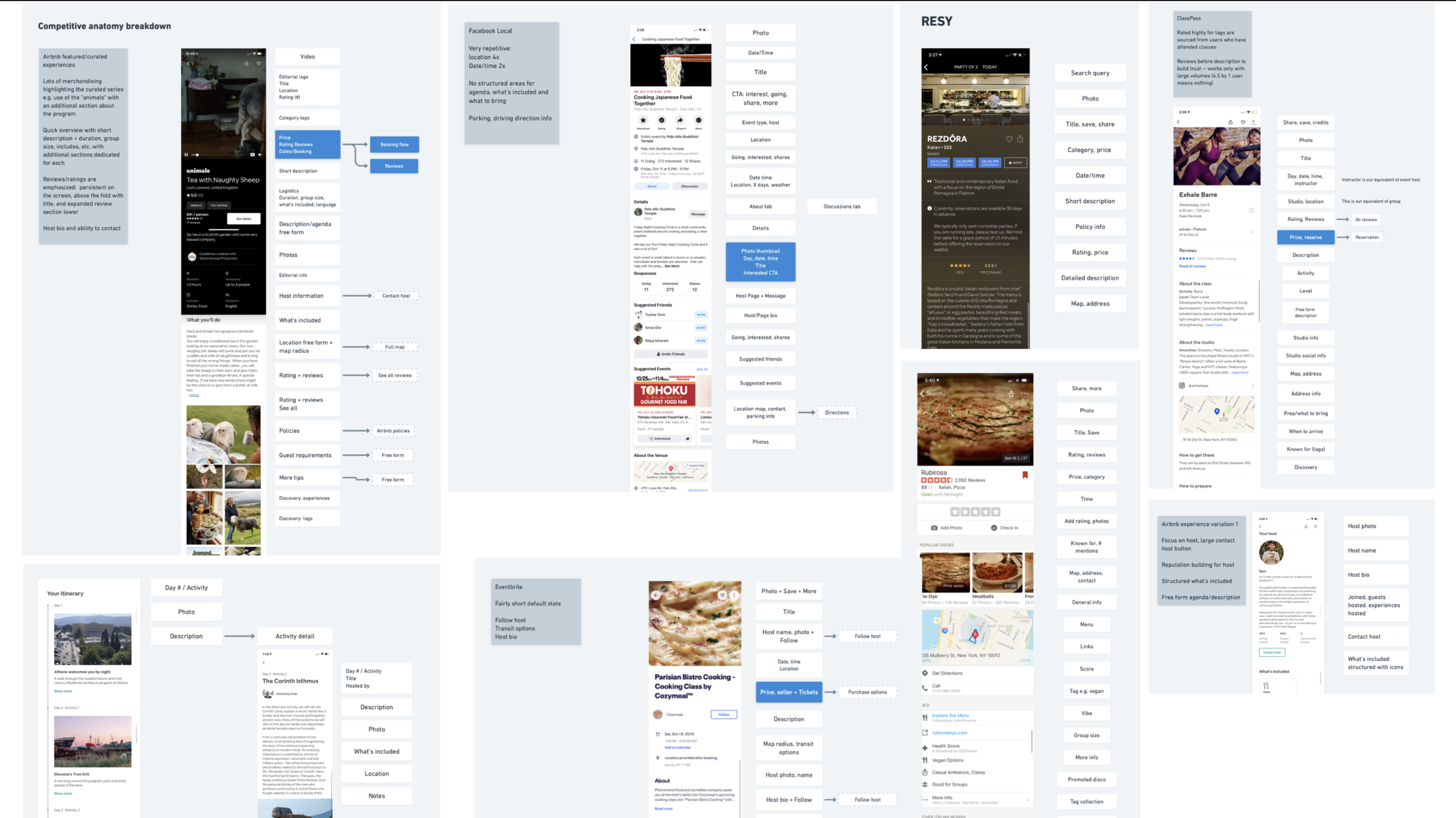
Explorations & Competitive Anatomy Breakdown
New Event Home
Shipped March 2020 on iOS, Android, and Web
Left to right: Emphasis on photos, agenda for better evaluation, structured fields to help attendees prepare, and attendee identity & location obfuscation
A seamless cross-platform checkout experience to minimize friction for active users attending several events at nominal prices.
Event Tickets
Meetup offers several different ways in which attendees and potential attendees can view and attend events which are hosted by Groups — Groups on Meetup can either be private or public, and organizers choose whether members have to request permission, answer certain questions, or sometimes pay dues to join the group.
This led to the old Event Home having several different states and accounting for all the complexities, without adapting to the unique needs of the viewer — who could either be evaluating an event, or already attending. The Event Ticket aims to solve this problem by providing a distinct ticket experience for members who are attending an event.
Once the decision to go the event has been made, the ticket page focuses on some key jobs such as adding it to their calendar, easy naviagtion to the event / link to join for online events, and other encouraging attendees to further engage by sharing the event with their friends or learning more about other attendees.
The ticket also provides information that is obfuscated pre-purchase such as the actual location (address or link), instructions on how to find the event (access codes or passwords for online events), and quick reminders for what attendees need to bring,.
Tickets for upcoming events (L) and the post-rsvp tickets experience
Roll-out strategy
A large part of this project included a technical re-platforming of Meetup. This meant that this new Event Home was inaccessible through most of the regular endpoints where events are promoted on Meetup — i.e. all the discovery and search surfaces, regular email digests, and in some cases the full event list on the Group’s home page. The new Event Home is built for all platforms — iOS, Android, mobile web and desktop web, which meant the member side roll out would be cross platform too.
On the other hand, organizers could not create these events using the old event scheduler, and a new one was not built at the time. This made for a complicated roll out strategy for the pilot, one that required a lot of hands-on training and involvement with every organizer.
I created an organizer guide that was sent to every organizer in the pilot, which walked them through the exact steps required to create their new event, and an explanation of how their members will experience the new product. In addition to this, the team spoke organizers as needed to help them create events.
In addition to this, we set up stop gap measures to ensure a seamless experience for members by leveraging existing patterns such as featured event shelves, and targeted event announcement and reminders to group members to ensure organizers got at least the same number of attendees they got before starting the pilot
Organizer guide & form used to create events in the pilot
Results
To our surprise, we were able to maintain the number of attendees for the new events hosted in the pilot without all the regular touchpoints where those events would be discovered. The pilot size was too small for hard quantitative metrics, however we saw an increase in both RSVP’s and conversion from Event Home > RSVP.
Hypothesis for increase in RSVP:
We advertised this event to a small, highly-targeted group of users (i.e., only group members). We hypothesize that these users are already high-intent and highly likely to RSVP. By only announcing the event to group members and excluding the event from discovery surfaces, we reduced the number of page views to mostly high-intent users. We hypothesize that this resulted in higher conversion. Further analysis can reveal if the majority of event RSVPs come from group members (we guess that it does!).
Opportunity: how might we take advantage of group affinity to drive conversion and increase the number of RSVPers on the platform?
Hypothesis for increase in conversion
The new Event Home merchandises events better than the old platform. The addition of an agenda, and preparation fields possibly resulted in potential attendees feeling like the event was well planned, and further seeing what is included gave them a sense of why it was worth paying for. This paired with the easier checkout flow made it easy for viewers to RSVP to the event.
Opportunity: how might we encourage organizers to plan and share a detailed agenda for their events?
Ultimately, we addressed both of these opportunities, and scaled the pilot to a private beta by building an event creation experience which productizes the learnings from our coaching and conversations with organizers to help them host high quality events.
70k members see this new Event Home across iOS, Android and web as of July.


